Three design systems, one honest comparison
All three directions are full homepages — this page holds the thinking behind them: each direction's palette and typography, why the three genuinely differ, what happens to your logo, and a preview of the new product imagery at the bottom.
The same brand, told three ways
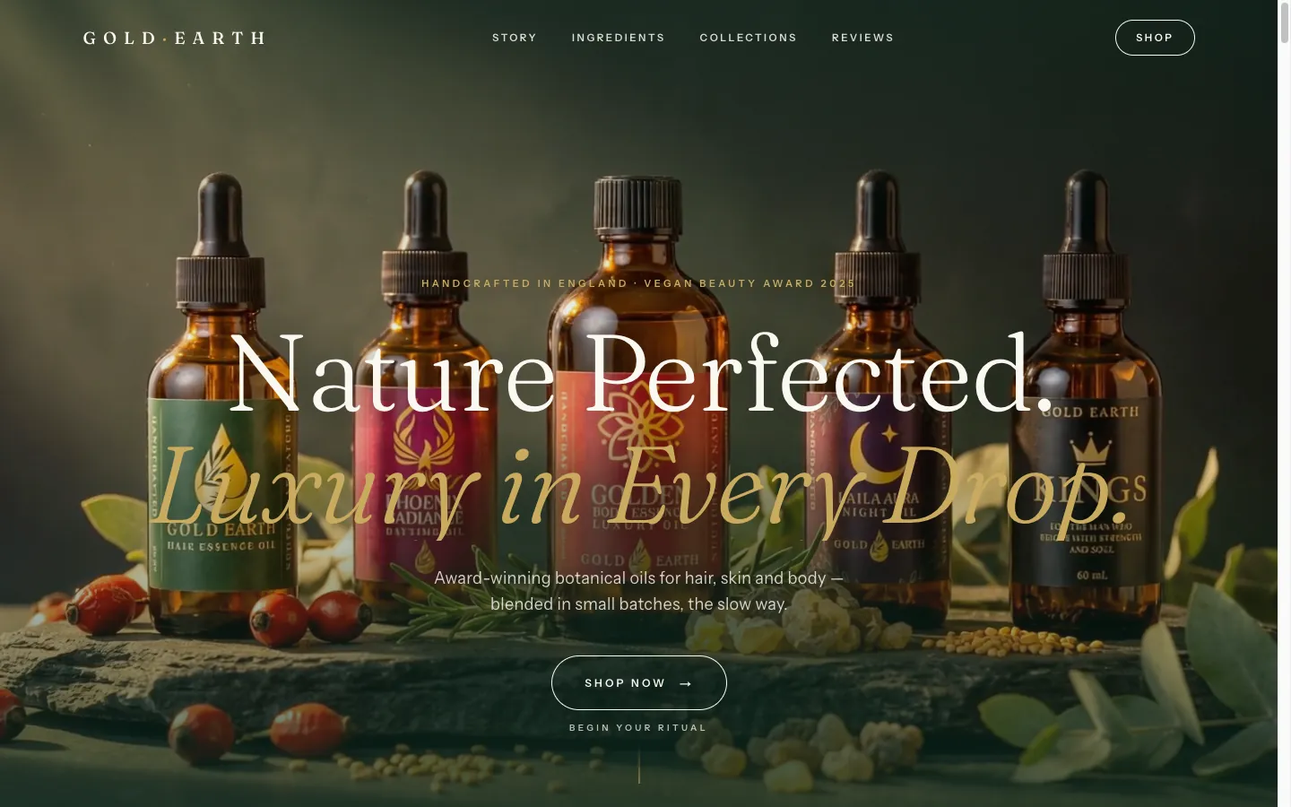
A · Modern Gold Botanical
Keeps your green-and-gold world and raises it to cinema — deep botanical green, warm ivory, gold used like light. Serif headlines with feeling, calm sans for everything else.
Closest to who Gold Earth already is; customers recognise the brand instantly, elevated.
B · Refined Apothecary
Leans into the handcrafted origin — ivory paper, peat ink, old gold, sage. Classic serif throughout, botanical line drawings, the feel of a beautiful label room.
Warmest and most personal; strongest at telling the small-batch, market-stall story.
C · Gallery Minimal
Strips everything back — near-white space, carbon type, gold only where it counts. Photography does the persuading; every oil presented like an object in a gallery.
The boldest change from today's site; depends most on the new photography.
All three share the same foundations underneath: your logo's drop emblem, your real products and prices, the award and CPSR trust marks, and your customers' words. The direction you choose decides the mood — nothing about the brand's substance changes.
Kept — and sharpened for the screen

What stays
Everything. The drop emblem with its botanical leaves is the most distinctive thing Gold Earth owns — it stays as your brand mark: on labels, as the site's favicon, on seals, packaging and social. The wordmark stays. “Nurture by Nature” stays wherever there is room to say it.
What changes on the website
Only how the lockup is used. The full stacked logo is tall and detailed — beautiful on a label, but squeezed into a slim website header it shrinks to a smudge. So the header carries the wordmark set in flat type, and the gradient gold is reserved for print and labels where it shines. This is standard luxury practice — the finest houses run a type-only header and let the emblem live on the product.
One ask
The original logo file (ideally the vector or largest export) in the asset folder — so every use of the emblem is perfectly crisp, never scaled up from a small web image.
Modern Gold Botanical — the system
Nature perfected. Luxury in every drop.
Botanical oils for hair, skin and body — crafted the slow way.
 See the full homepage
Palette
Typography
Expressive serif + calm sans
Serif display carries the emotion in headlines; a clean modern sans handles navigation, labels and detail. Gold italic for the words that matter.
Best if
You want the current green-and-gold identity kept but made premium — warm, cinematic, unmistakably Gold Earth.
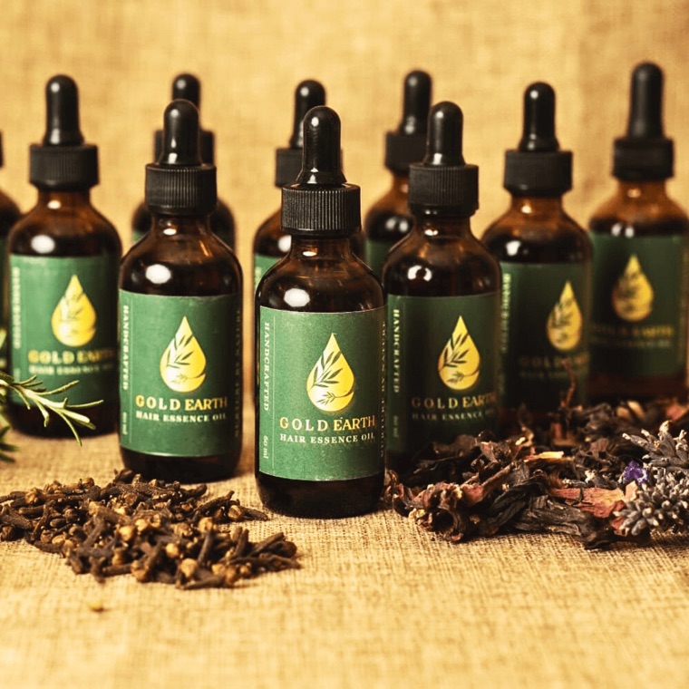
Refined Apothecary
Twenty-nine botanicals.
One quiet ritual.
Blended slowly, the way apothecaries always have.
Palette
Typography
Classic serif throughout
Serif carries headlines and body; small caps for labels. Botanical line illustrations frame each oil's ingredient story.
Best if
You want the handcrafted, market-stall origin story elevated — honest, warm, collectable.
Gallery Minimal
Palette
Typography
Light sans, wide tracking
Type recedes; photography and white space do the persuading. Every product presented like an object in a gallery.
Best if
You want maximum departure from today's look. Depends most on the new photography — strongest paired with the new photography.
Your products, reshot — before and after
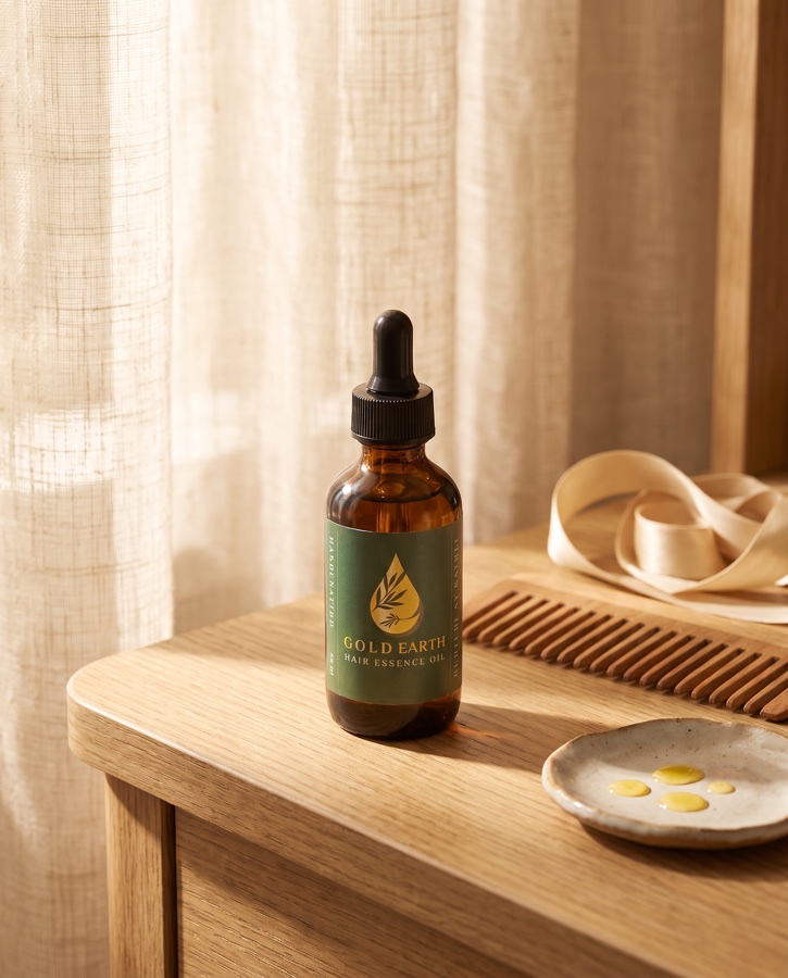
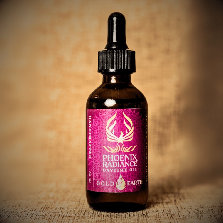
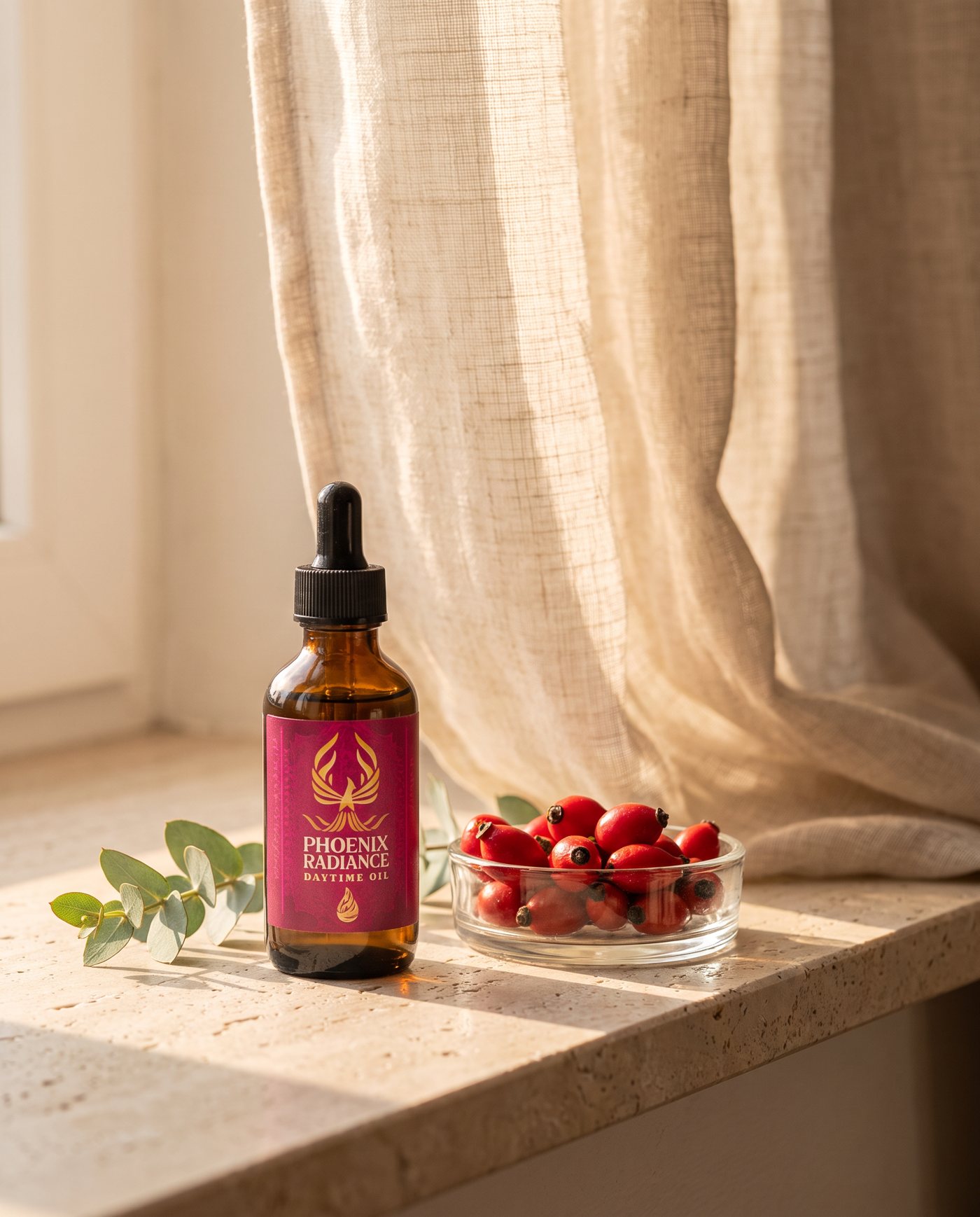
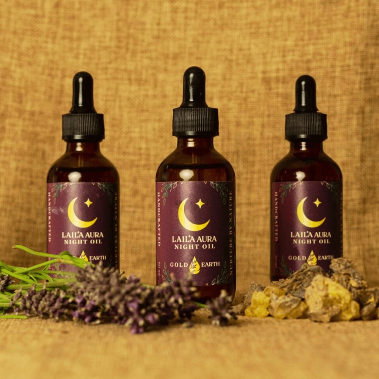
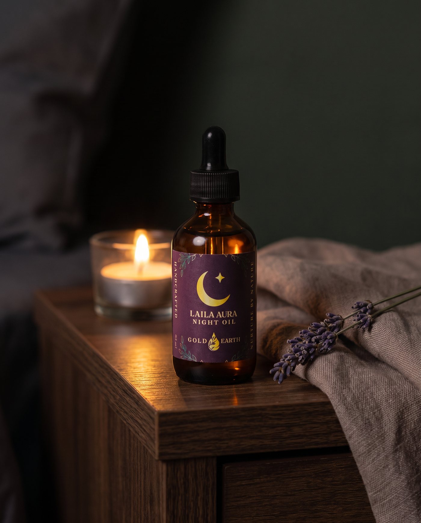
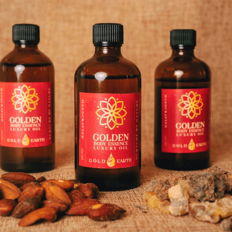
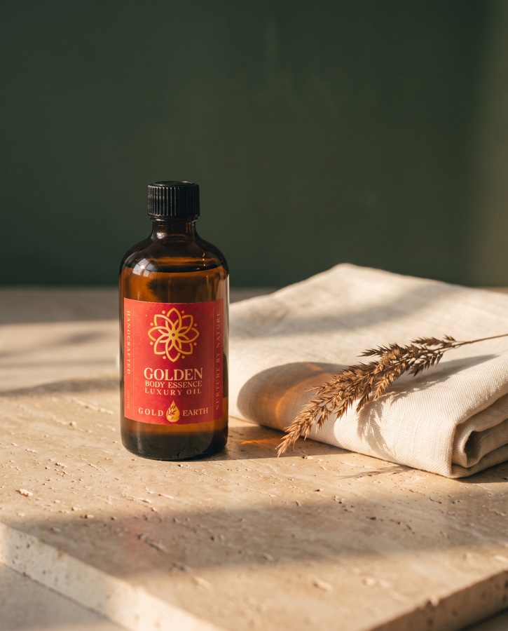
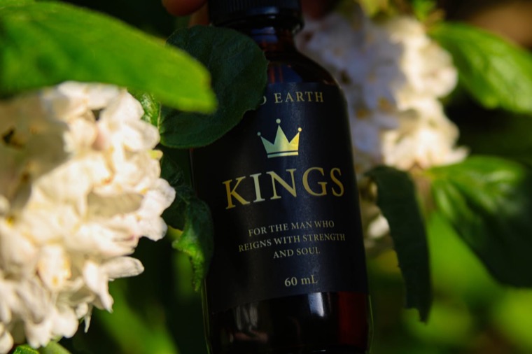
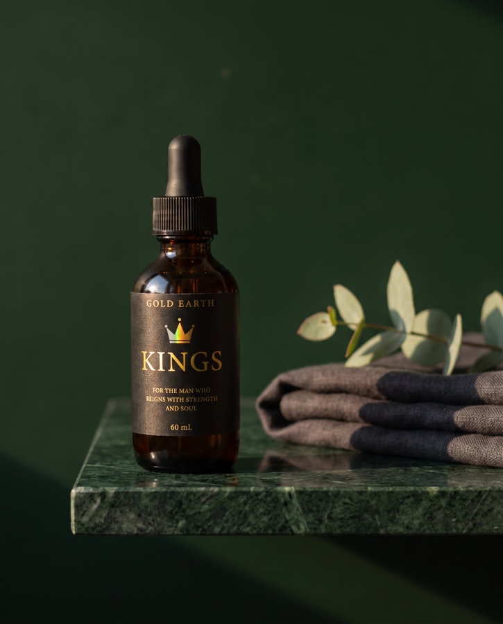
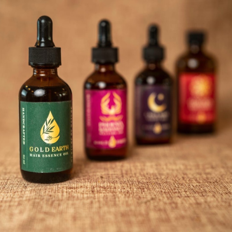
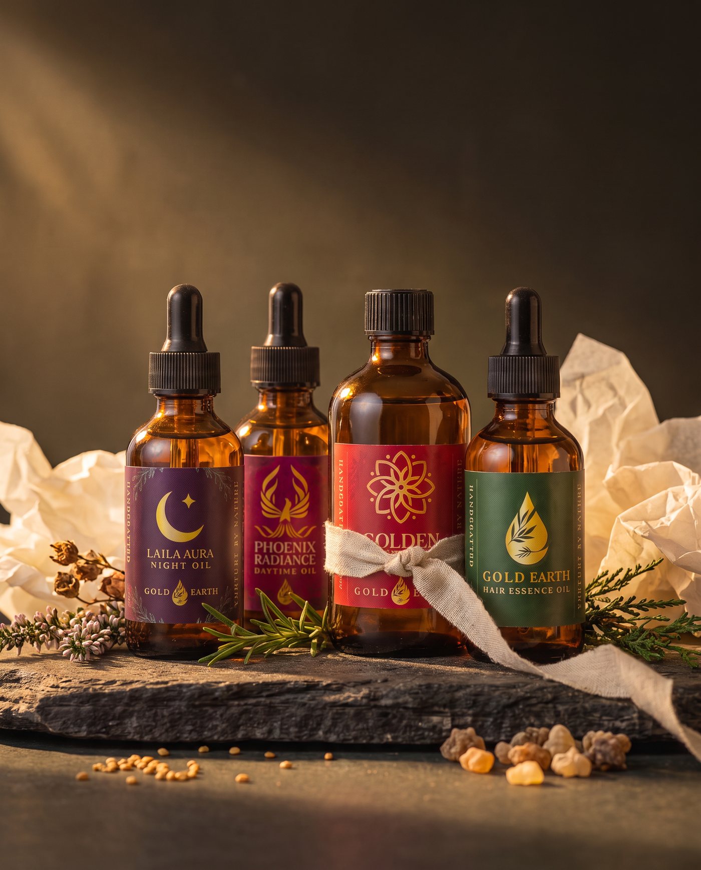
Each concept image is produced from Gold Earth's own product photography — bottle, label and typography are preserved, only the scene changes. The full package delivers forty finished images in this quality across all eight products, with Instagram crops to match.