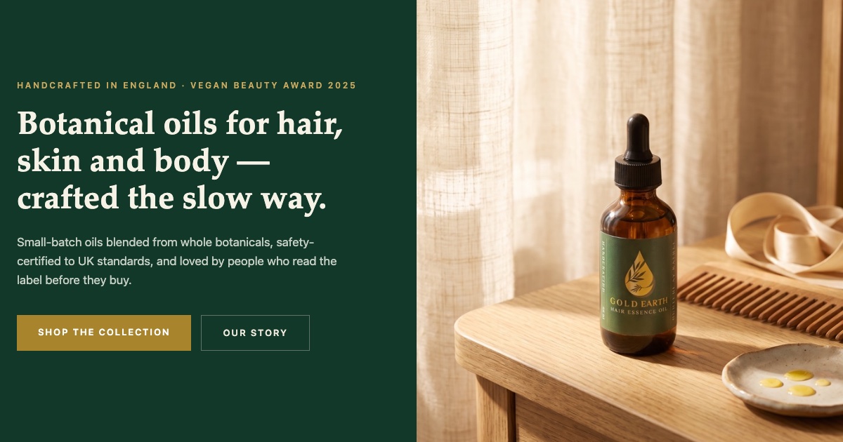
Modern Gold Botanical
Your green and gold, elevated — deep botanical tones, warm light, your award and a real customer's story given the space they deserve. Our recommendation.
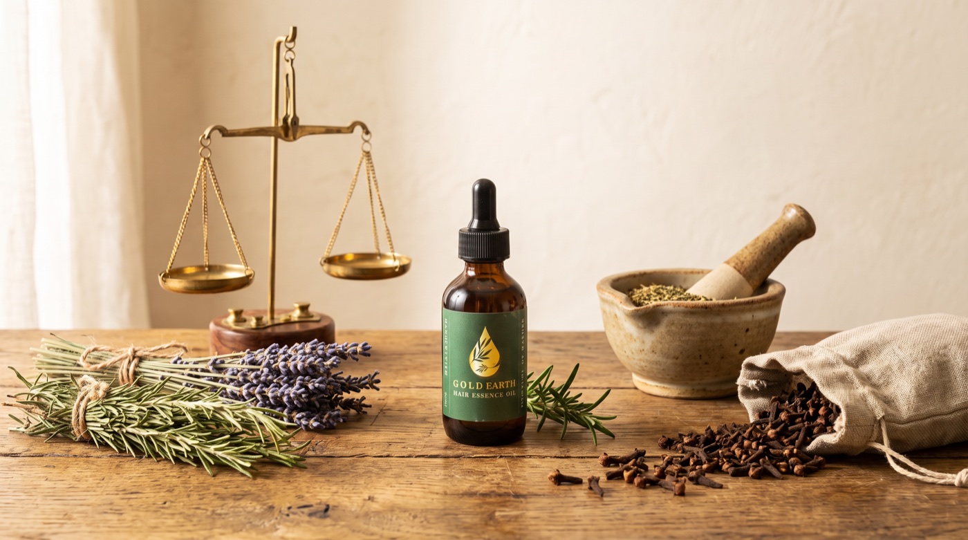
Refined Apothecary
Warm ivory, classic serif, and the craft itself on show — brass scales, dried herbs, the twenty-nine-botanical recipe told like a story. Your market-stall origins, dressed for Liberty's shelves.
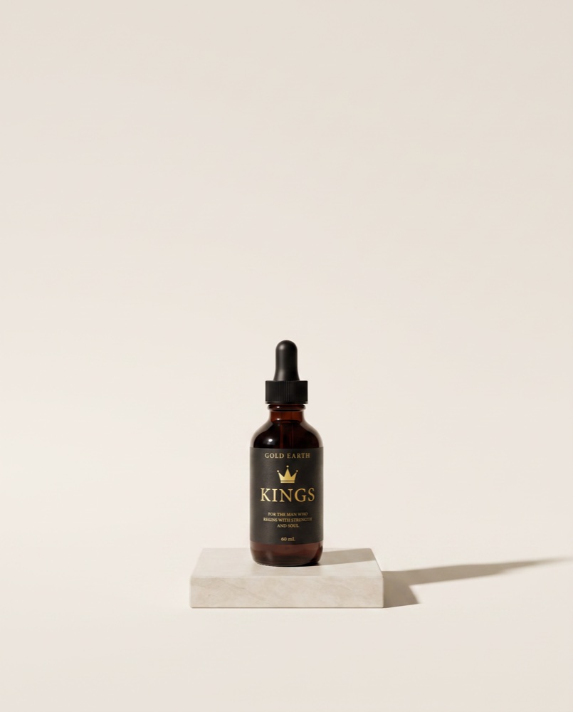
Gallery Minimal
Near-white space and quiet confidence — every oil presented like an object in a gallery, numbered 01 to 08. The boldest departure from today's look.
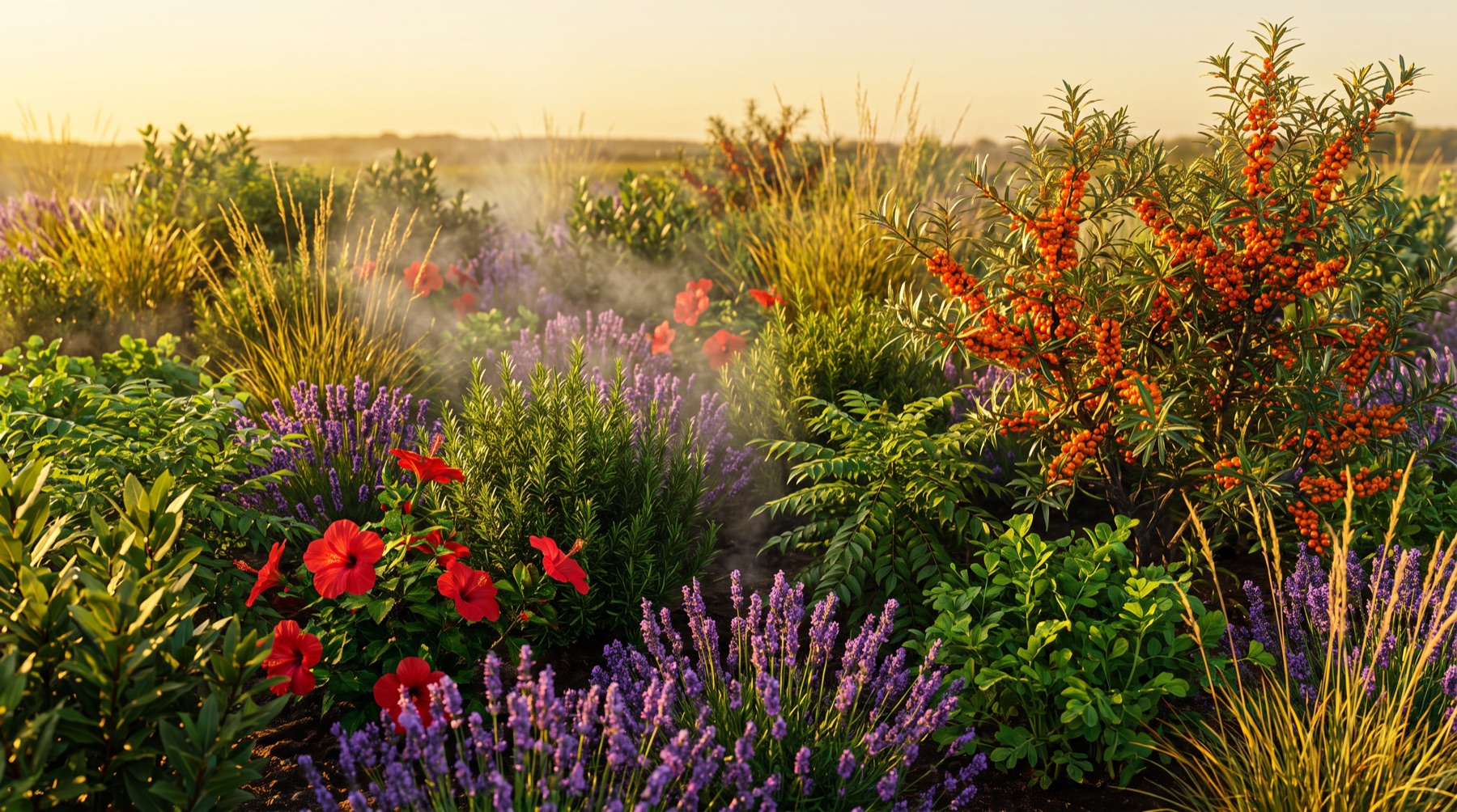
"The 29" — an immersive scroll story
One golden drop falls on dry ground, a royal garden blooms, and all twenty-nine botanicals of your Hair Essence drift past the bottle. Scroll it slowly — ideally with sound off and expectations up.
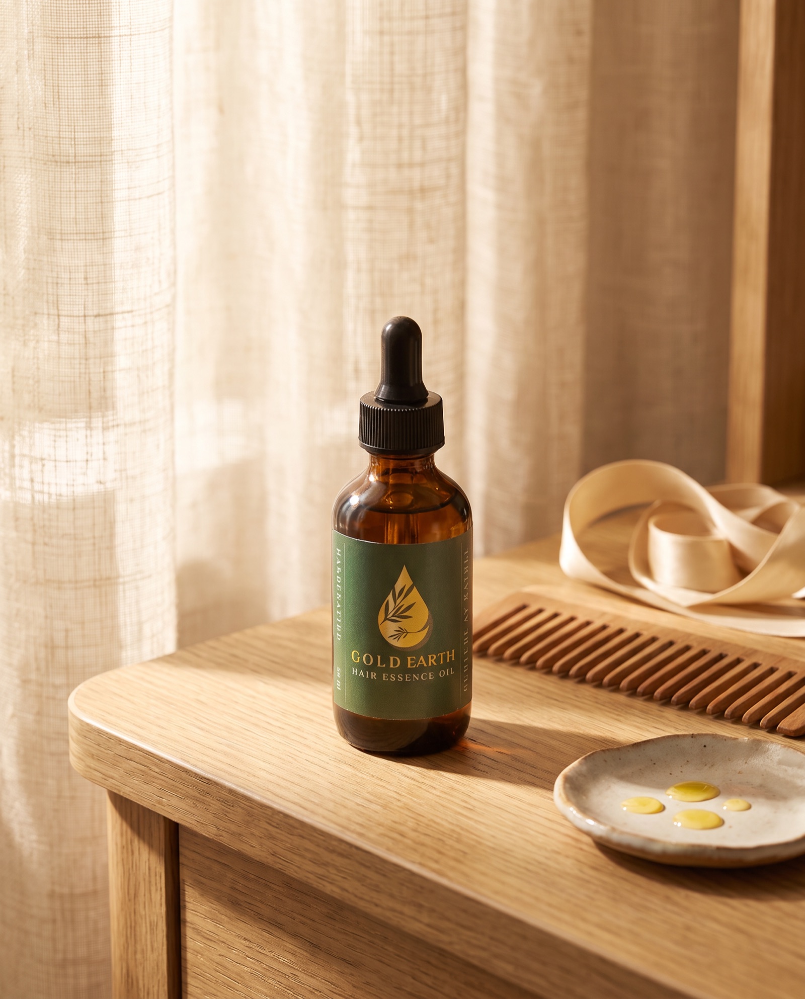
"One Drop" — a scroll film
The whole page is one continuous shot. A single golden drop falls as you scroll — from light, to earth, through the ritual, into the bottle. Best on a laptop, taken slowly.
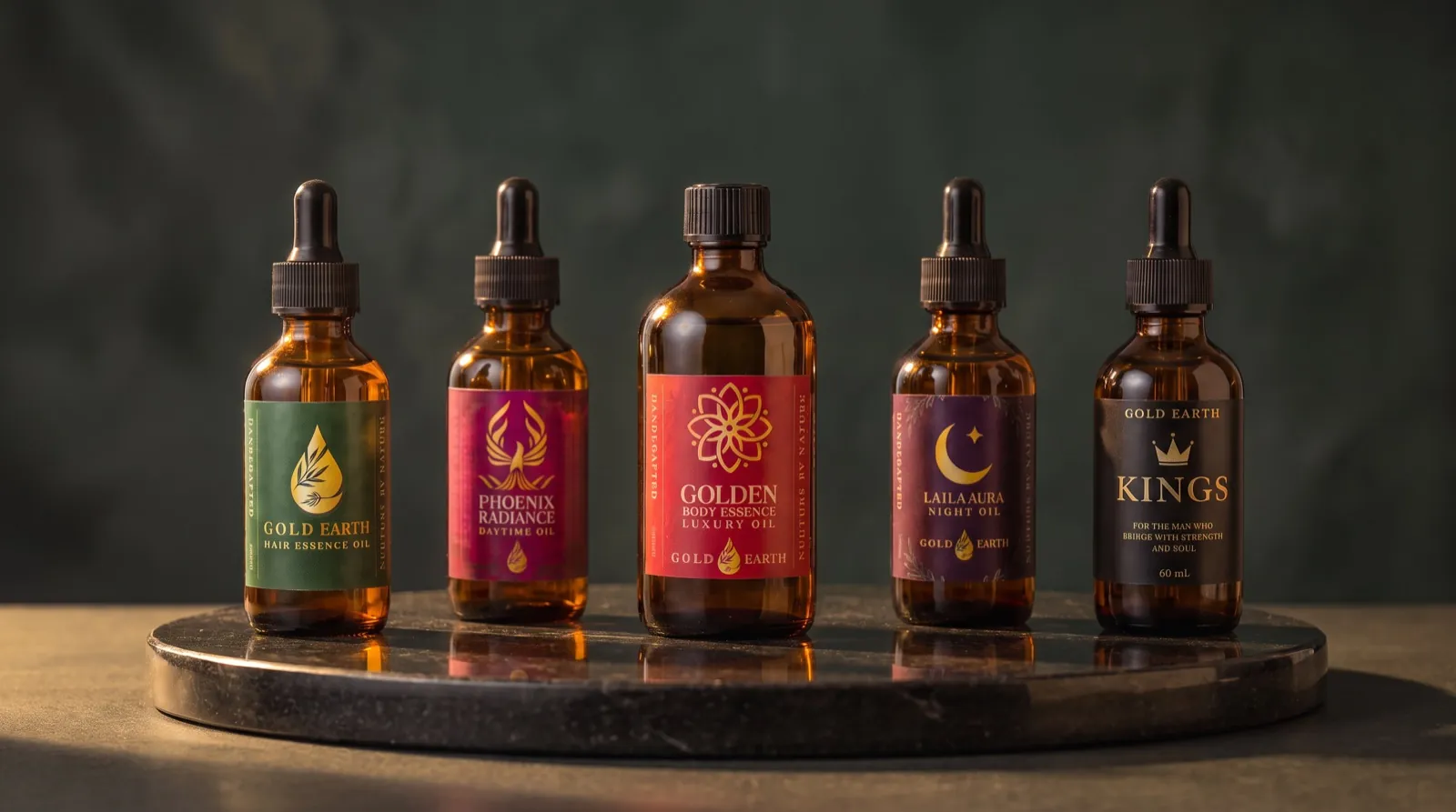
The three design systems — and your bottles, reshot
All three design systems compared honestly — plus your current photographs next to the new ones, side by side, across six products. Bottle and label untouched; only the world around them changes.
A note on what you are looking at
These are concepts, not finished work — made from your existing photographs so you can judge a direction rather than a description. If one of them feels right, the proposal covers building it out properly in ten working days, on a copy of your store, with your live site untouched until you approve it.